CASE STUDY
How a Manufacturer Representative Scaled their Brand
How this busy rep firm in Florida took their image to the next level by working with the team at Bran Marketing.
Meet Marsh & Moore, Inc.
This third generation Manufacturer Representative Firm based out of St. Augustine, FL was in need of a brand overhaul to take their agency to the next level. As the 2nd generation turned over ownership to the 3rd generation, they wanted to make big change that reflects the agency they had grown into.
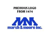
At Bran Marketing, we took great care in redesigning Marsh & Moore’s logo to honor its legacy while modernizing its appearance. The original double MM’s, created in 1974, were preserved as requested, ensuring the logo retained its familiar look.
We also maintained the cherished blue color scheme, a signature element that was important to the family legacy. The new design not only resonated well with their customers but also stands out against industry peers, particularly on banners, where it truly pops and draws attention.

Brand Development
We revamped their entire look down to logos, color schemes and more. They had been using a logo their father had used when he started their agency over 50 years ago.
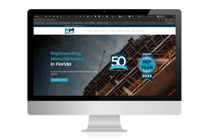
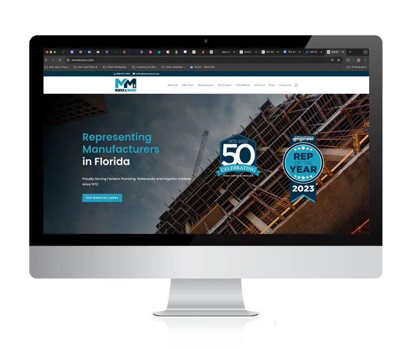
Website Development
With a new look came a brand new website with a modern look and feel to carry through the next decade.
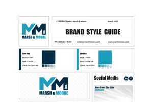
Style Guide
Marsh & Moore have a proper Style Guide that they can follow as a team and to send to others who interact with Marsh & Moore.
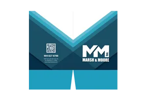
Pocket Folders
We created a generic pocket folder for the team at Marsh & Moore to add that professional touch to client quotes and interactions.

Recognition
At Bran we LOVE when our clients get the recognition they deserve. Marsh & Moore was Rep of the Year in Plumbing & Mechanical Engineer in 2023.
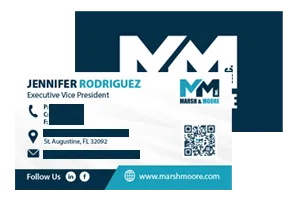
Business Card Development
Business cards with QR codes are the thing these days, and we helped Marsh and Moore outfit their entire team with new business cards.
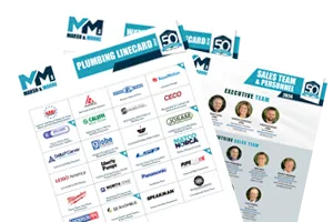
Line Card Development
We specialize in Line Card development and created several line cards for the variety of manufacturers this busy rep firm serves.
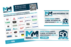
Ad Development
Even an agency like this needs ad development. From paid advertising to online web ads, we take care of every forward facing document for M&M.
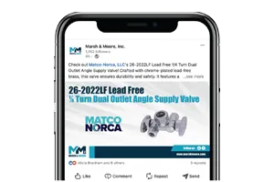
Social Media Management
We curate, design and manage Marsh & Moore's social media accounts on LinkedIn and Facebook.
Looking for that RIGHT FIT help for your business?
Bran Marketing is your answer. Let's Talk.
Here's Jennifer's Video Review
At ASA's Network 2023 last year in Orlando, we asked a few of our clients to do a video review of working with the team at Bran Marketing. Here what Jennifer Rodriguez, Executive Vice President of Marsh & Moore, Inc.
Work with Us Now!
Stop putting off the creative work that your team needs to sell your products and services.

Copyright © 2024 Bran Marketing. All Rights Reserved.
Contact
info@getbran.com
(385) 429-6368